Editorial &
Layout Design
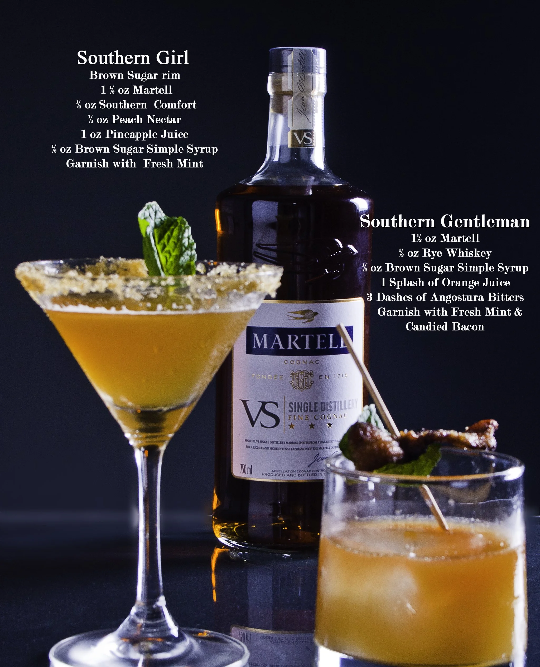
Cocktail Recipe Book Spread
Editorial & Layout Design
Client / Brand Context: Martell (Conceptual / Campaign-Based Editorial)
Project Type: Editorial & Layout Design
Role: Graphic Designer
Additional Roles: Photography, Photo Editing
Tools: Adobe InDesign, Photoshop, Lightroom
Case Study
Project Overview
This project explores editorial layout and typography through a cocktail recipe book spread designed to highlight craft cocktails featuring Martell Cognac. The goal was to create a refined, editorial-style composition that balances strong visual storytelling with clear, legible recipe information—appropriate for a premium spirits publication.
The spread was designed to feel elegant, approachable, and brand-aligned, emphasizing both the experience of the drink and the clarity of the recipe.
The Challenge
The primary challenge was presenting detailed recipe information without overwhelming the imagery or compromising the sense of luxury associated with the brand. The layout needed to:
Support clear hierarchy and readability
Allow photography to lead while typography complements
Maintain consistency across multiple cocktail variations
Feel cohesive within a larger multi-page publication
The Approach
The layout was structured using editorial design principles commonly found in cookbooks and lifestyle publications.
Key design decisions included:
Typographic Hierarchy: A serif typeface was selected for cocktail names to convey sophistication, paired with restrained body text for ingredient lists to ensure clarity.
Grid & Alignment: Text blocks were carefully positioned to frame the imagery without overlapping focal points, creating an intuitive reading flow.
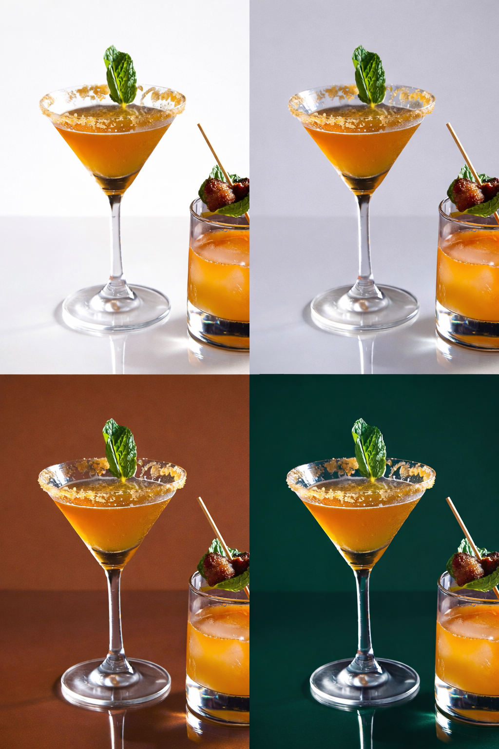
White Space & Contrast: Generous negative space allows the photography to breathe while ensuring legibility against a dark background.
Visual Consistency: Repeated typographic styles and spacing establish a system that can scale across additional pages in the recipe book.
The Solution
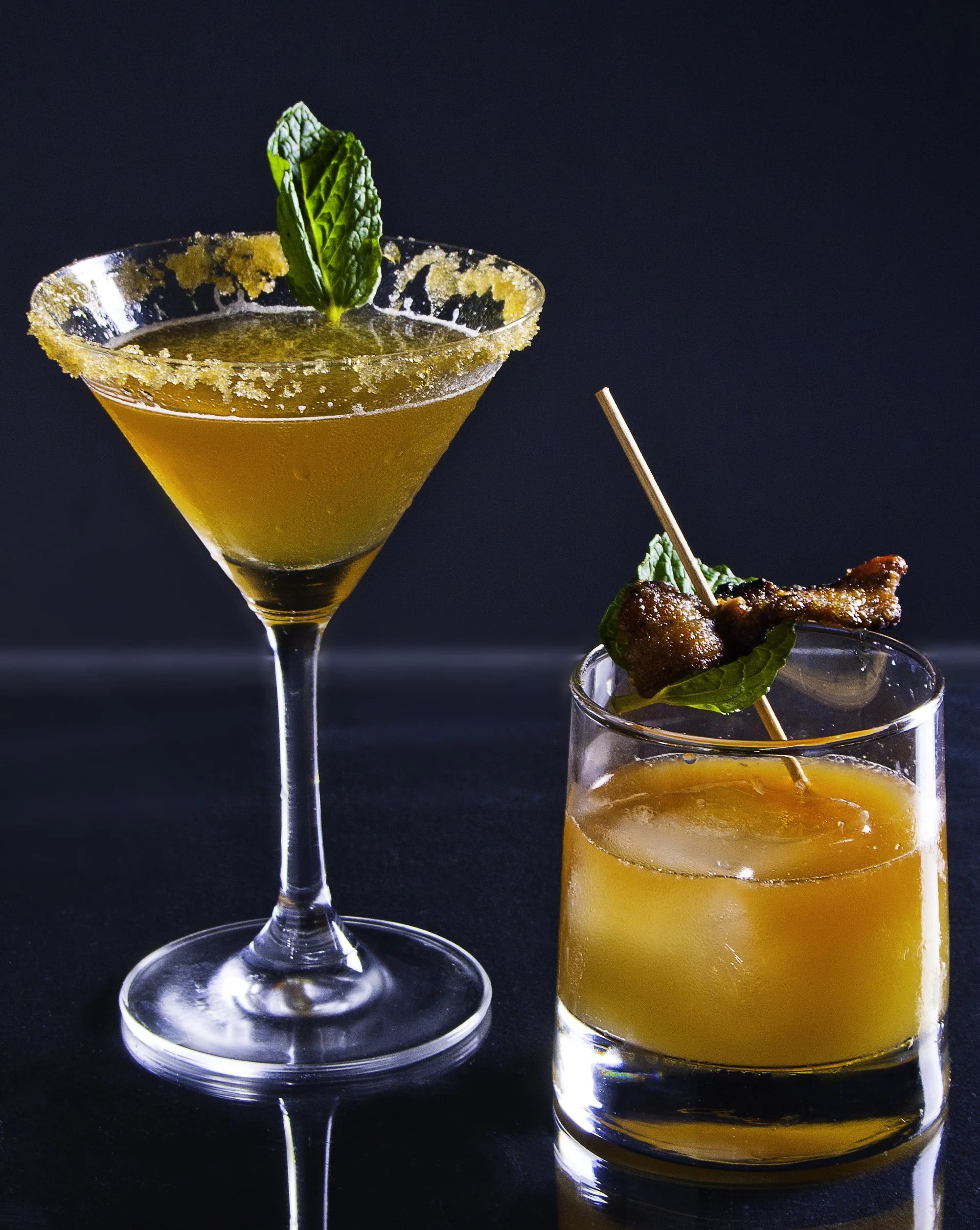
The final spread presents two cocktails within a cohesive editorial system, balancing detailed recipes with strong visual impact. The layout supports both quick reference and visual engagement, making it suitable for print or digital publication.
Photography and post-production were handled in-house to ensure the imagery aligned precisely with the intended tone, lighting, and color balance of the layout.
The Outcome
The completed design demonstrates a strong understanding of editorial hierarchy, typography, and layout control. The spread feels polished and publication-ready, showcasing how structured design systems can elevate content while maintaining clarity and brand alignment.
This project highlights the ability to translate brand tone into editorial form while designing layouts that are both functional and visually compelling.